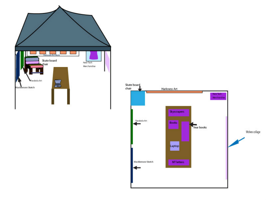
Race for the Arts booth.
This is a design that I made based off a project that required my group to think about different types of art that would represent our school. We decided to pick these art works because we each felt that the art helped others see what New Tech was about. All the art shows that New Tech has different types of art and different students making them.
Repetition, symmetry, radial balance, blends and more.
Design Challenge: Group A


For this mini project my partner and I got most of our designs by playing around on Illustrator.
Tessellation art
9/3 Challenge A:
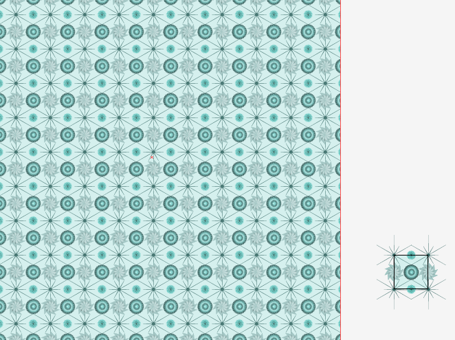
My partner and I decided that our pattern's name should be Baby Boy Blue because the colors and pattern combined looks like a baby boys blanket. We also thought that the pattern would look great on a tissue box or as christmas gift wrap. The requirements for this challenge are the color scheme has to be monochromatic. The corner designs had to be made up of star that have more than 5 points. The additional challenge that we picked was to use the pucker and bloat in one of the designs.
T-shirts
Text patterns
Text Designs on Fabric.
The Droste Effect.
1. What is the droste effect? Describe / define the technique.
Using a frame with in a picture, to repeat the image.
2. How did you edit your photo to improve your design?
I used effects to brighten the image, and to high light and darken certain areas.
3. How does your design / image show both creativity and skill?
I feel this was creative because the frame was something that some might not think of.
4. What do you want people to notice and / or know about your design?
The photo quality is something that I feel people will notice about my design.
Symmetrical Repetition
What did you use for / from your photo to create your design? Describe what you used and your design process?
To create my designs I pick photos that I thought would be great to use and make symmetrical. I first selected the sky blue and deleted it from my photo. Then I rotated the picture and changed the brightness and hue of the photos.
What do you want people to notice about your work?
I feel that my work is vibrant and the colors go great together. The way the photos are rotated makes me want to look at it.
Symmetrical; Repetition version 2
1. What did you use for / from your photo to create your design? Describe what you used and your design process?
For the fish tank design I used the bubble maker in the fish tank and for the magnet design I used a magnet that you can move the arms, legs, and head. I cropped certain parts of the photo out of the design in order to create the design that I wanted.
2. What do you want people to notice about your work?
The color combinations and the parts of the designs that repeat.
3. How does your second version improve upon your first version?
My second version is improved from my first because the photos I used were of things that some people might not think about photographing. And I feel that me designs are better and well thought out.
Shoe Design
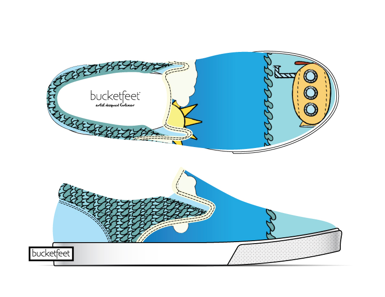
Photo with pattern background.
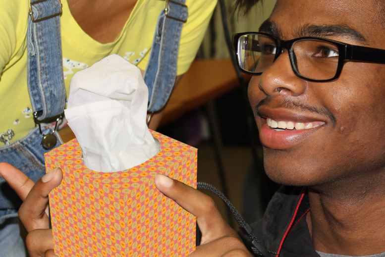
Tissue Box Design
Juxtaposition
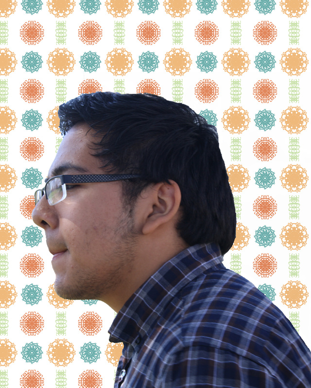
1. Explain the imagery used within your profile silhouette
The photo I picked to put inside of my silhouette are ocean waves. I picked this photo because the ocean is one of my favorite place to go.
2. What do you want people to notice about your work?
I want people to notice the different colors of the water and the shape of the wave. If they look closely they can see basic lines of my face.
3. How does your design show creativity, skill and agency?
This shows creativity because of how I placed the waves and how I had it so littles parts of my face shows through. This shows skill because of the program and tools that I used, like clipping mask and the quick selection tool. This shows agency because I went through several different types of photos , like before I was going to put a photo of trees but I changed it because I felt it did not work how I wanted.
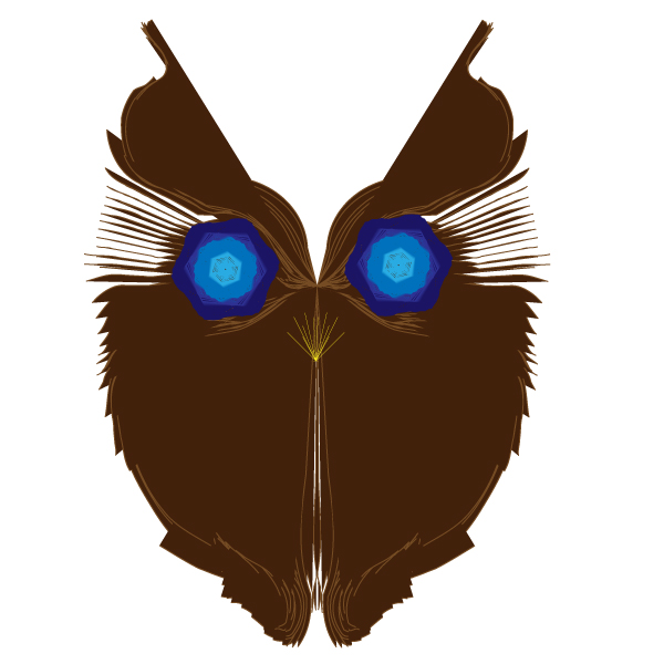
Butterfly pin tool
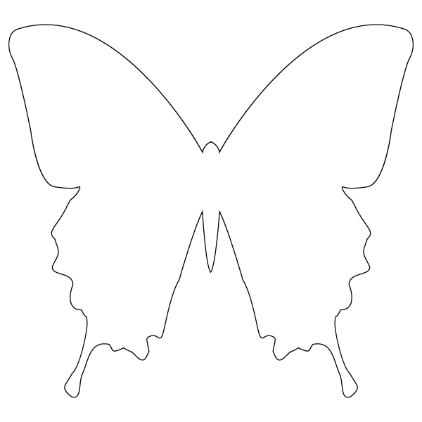
Butterfly outline using the pin tool.
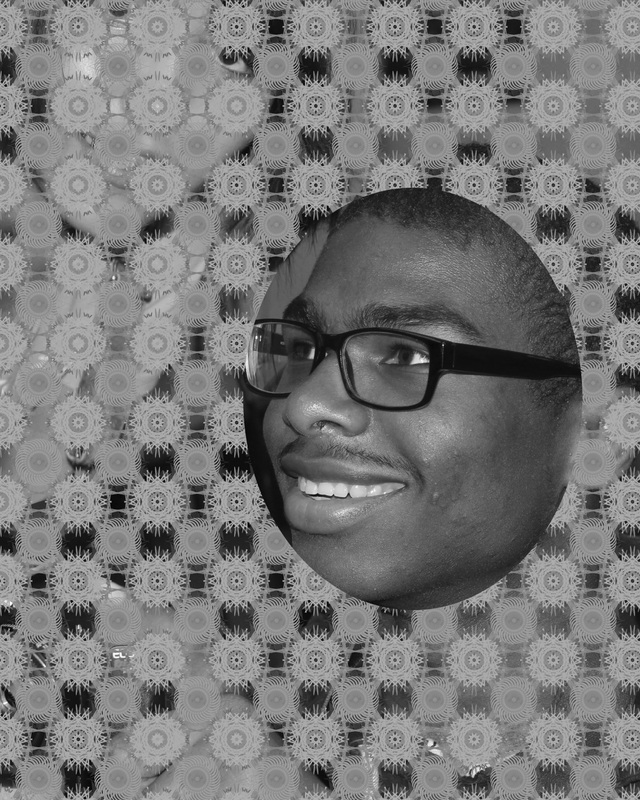
Abstract portrait
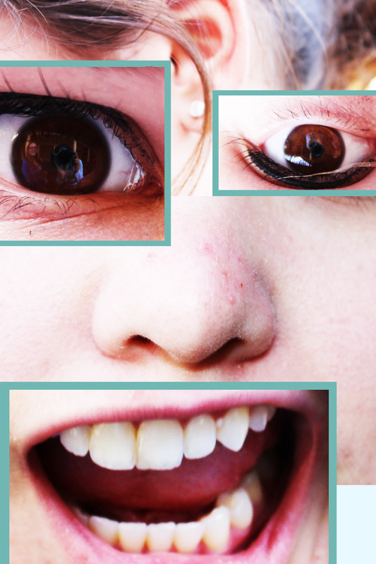
1. What do you want people to notice about your work?
I want others to notice that I flipped parts of my face and for my mouth I used a funny type of expression.
2. List adjustment layer(s) used and how they improve your work.
For this project I used brightness and contrast because the original photos brightness was low and did not match my bright expression.
Eyes and Face outline
For my Neil Degrasse Tyson portrait I wanted to add as much detail as I could. For this project we have to pick as subject that we to make a portrait for. The tools that I used were the eyedropper tool and the pin tool. I picked Neil Degrasse Tyson as my subject because I enjoy his points of view and the arguments he makes. One thing that I want people to know about this artwork is that it took a very long time and I wanted to give up several time. I am very happy with the end product.
Poly Low Portrait
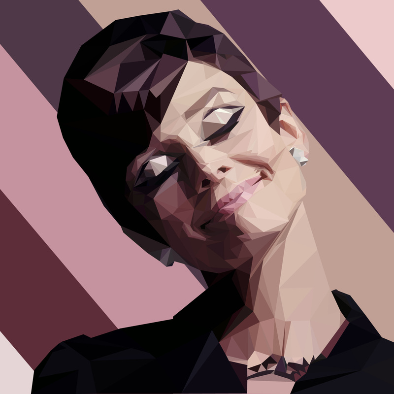
I wanted to use Audrey Hepburn as my subject because she is one of my favorite actor / celebrities. When looking at my artwork I want others to see how much detail I put into the portrait. My artwork shows agency because I worked on it for a long time and I really wanted to give up. I am glad that I didn’t give up because it looks good. To make this portrait I used the style Low Poly Portrait that uses Illustrator, the pen tool, the eyedropper and a layer adjustment. This style uses just triangles to make the details of the portrait.
