Shoe Design

In this project I had to create a shoe design and an ad to try and sell the shoes. The tools that I am comfortable using is lasso which if you use it you can select a certain area and paint or erase the area selected. And the paint brush tool which allows you to paint. An obstacle to I had in the beginning is not putting everything on the same layer and then having to start over because I would mess up. Some new vocabulary words I learned contrast and value. Contrast are oposites. Value is from light to dark.The best part of the project is the end because I get to see my end product. The hardest part was naming everything because I am bad at naming stuff. Everything I learned in the beginning I didn't know before. The valuable part is creating new layers because they are important.
Renaissance Project:

In this project we were given a artist durning the Renaissance. The artist I received was Giorgia Vasari. He was a painter, and writer. He was more known for one of his books that was about other Italian artist. One of the obstacles I had during this project was choosing the painting he made and were to put them. I learned that renaissance means rebirth. The best part was learning about my artist. The hardest part was picking only a few paints out of many. I also learned that the black plague had a large part of the renaissance.
Self portrait
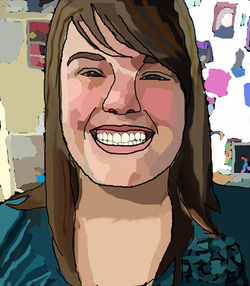
I used the paint brush, eyedropper, the smudge tool. Some obstacles I had was the colors were to dark in some places. The best part of this project was the end to see the painting look like how it is suppost to. The hardest part was painting in the circles I made for the different colors. I learned that you face is made with different color shades.
Attributes:
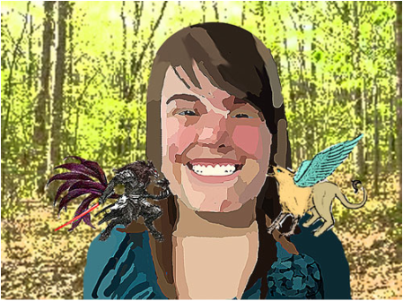
Describe: I see myself with a good and bad mythological animal. I used a 10 tailed wolf to symbolize the bad and a griffin as the good side. They are located on both shoulders. The atmosphere is light.
2. Analyze: The balance is formal because it is equal on both sides. The colors that dominate are light.
Both my face and the attributes dominate my painting.
3. Interpret: My painting shows the good and the bad.
4. Judge: If you were to do this painting over, or had more time, what changes would you make?
If I were to repaint this I would probably do nothing different.
Movie poster

In this project I wanted to make a poster that looked like a scary/ comedy. I like the way it turned out. The main part of this poster is the guy in the middle. Who looks kinda like a killer. The title is REJECTION ...AND NOT THE GOOD KIND. The movie will be about a science experiment gone wrong and the text subject ended up a killer.
Drag and drop game:

For this project I used Adobe Flash CS4. Some of the stuff I learned using this program is that it uses vector so the images don't come out with pixels. Some difficulties I faced with this project was making sure the coding worked the was it is supposed to.A new vocabulary word I learned is vector and raster, they both have to do with the way a image comes out.The most important thing for this project for me is making sure everything worked and the drop zones work right.The best part of this project for me is making the cloths and character.The hardest part is importing the sound because sometimes it doesn't work the right way. I learned how to use Flash better.
Propaganda
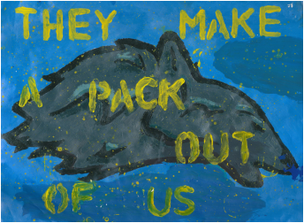
My propaganda poster uses a wolf as the main symbol. And it says "THEY MAKE A PACK OUT OF US." Sense our schools mascots is a wolf and we are like a family. So it's like the wolves brings us together to make us a pack. This would be a bandwagon because it talks about everyone as a group. The dominant color in my poster is blue and yellow. I chose these colors because they colors go together and I feel that they don't take the attention away from the wolf to much. This propaganda is trying to say that we are family/pack and we should try to use that to grow.
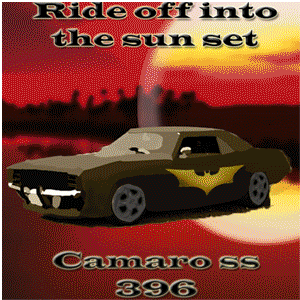
Car ad.
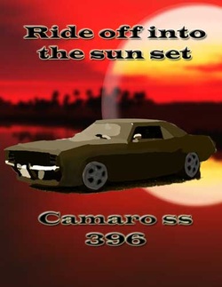
In this project I used the pen tool a lot. At the beginning of this project I didn't know how to use the pen tool but now I know how. I liked this project because it was fun and easy to understand. The best part of this project was that I got to pick my own car to work on and I could pick the color to change it to. The hardest part was getting small details.
For my last project I had to make a slideshow of most of my art works.
